Brand guidelines
How to use the Choreo Labs logo, colour and type correctly in materials you create with or for us.
Version 1.1 · November 2026
Introduction
Using this guide
For agencies, event vendors, resellers and technology partners. Everything you need to place our brand on co-marketing, event, print and digital materials.
Approvals. Send co-branded artwork to your Choreo Labs partner or marketing contact before it is published or printed. Allow five working days.
01 · The logo
Logo lockups
The C mark, six ovals in motion around a centre, paired with the Choreo Labs wordmark. Start with the primary lockup; switch only when the space calls for it.

Horizontal · default for everything 
Stacked · square and tall spaces 
Centred · large format, stage and signage 
C mark · icons and avatars
01 · The logo
Colour versions
Midnight Ink or white only, whichever gives the strongest contrast. Use black only for single-colour print.
The dot-lattice mark is reserved for Choreo Labs campaign artwork. Partners use the solid logo.
Midnight Ink on white or Paper 
White on Blackout Midnight Ink on Signal White on Cobalt
01 · The logo
Clear space & minimum size
Keep at least x clear on every side, where x is the height of the C in the wordmark. Nothing else, type, images or other logos, sits inside that space.
Wordmark. Sora Medium, weight-matched to the mark. Never retype it; always use the supplied files.
-
Horizontal
Primary lockup, the default everywhere
- Clear space
- x = height of the C
- Min. on screen
- 120 px wide
- Min. in print
- 30 mm wide
- Colours
- Navy · Black · White
-
Stacked
Square and tall spaces, social avatars, signage
- Clear space
- x = height of the C
- Min. on screen
- 96 px wide
- Min. in print
- 24 mm wide
- Colours
- Navy · Black · White
-
Centred
Large format: stage screens, signage, merchandise, end frames
- Clear space
- x = height of the C
- Min. on screen
- 160 px wide
- Min. in print
- 40 mm wide
- Colours
- Navy · Black · White
-
C mark
App icons, favicons and avatars, once the brand is already named
- Clear space
- x = a quarter of the mark height
- Min. on screen
- 24 px tall (16 px favicon)
- Min. in print
- 8 mm tall
- Colours
- Navy · Black · White
01 · The logo
What not to do
The logo only works when it is reproduced exactly. If something isn’t covered here, ask before you publish.
Don’t stretch Don’t rotate 
Don’t recolour Don’t add effects Don’t use low contrast 
Don’t use busy photos
02 · Colour
Core colours
Midnight Ink and white carry the brand. Signal orange is used sparingly, for the one thing that should be noticed.
- Orange text on light: Burn #C43300
- Text on Signal is Midnight Ink
- No gradients or tints
- Signal#FF4600RGB 255 70 0
- Midnight Ink#0B1633RGB 11 22 51
- Blackout#050A1CRGB 5 10 28
- Cobalt#1F4FFFRGB 31 79 255
- Paper#F4F6FARGB 244 246 250
- White#FFFFFFRGB 255 255 255
02 · Colour
Print colours
Use PANTONE Solid Coated spot inks where the job allows. For four-colour process, use the CMYK builds and ask for a hard proof on large-format jobs.
Cobalt is spot only. It sits outside the CMYK gamut, so print it as PANTONE 2728 C wherever it is the hero colour.
Dark areas. Print Blackout as 296 C or its CMYK build, never as 100 K. Where true black is needed, use rich black 70 55 40 100 for large solids and 100 K for small type.
| Colour | PANTONE | CMYK | HEX |
|---|---|---|---|
| Signal Orange | 021 C | 0 70 100 0 | #FF4600 |
| Burn | 173 C | 0 75 100 20 | #C43300 |
| Midnight Ink | 282 C | 95 70 15 70 | #0B1633 |
| Blackout | 296 C | 90 75 40 70 | #050A1C |
| Cobalt | 2728 C | 85 65 0 0 | #1F4FFF |
| Slate | 431 C | 55 40 30 20 | #5A6072 |
| Paper | 656 C 30% | 3 2 0 0 | #F4F6FA |
03 · Typography
Sora, and only Sora
Sora is our one typeface, for headlines, body and labels alike. It is free from Google Fonts and works on every platform. Always use Sora; no substitutes.
- Own your agentic future.Headline · SemiBold 600
- Govern every agentSubtitle · Light 300
- Software half the world runs on.Body · Regular 400
- Customer storiesEyebrow · SemiBold 600, uppercase
03 · Imagery
Photography & texture
Photography carries a Midnight colour wash: real people and places, toned into the brand blues. Apply it with the Choreo Labs Image Stylizer, or ask Choreo Labs for treated files. Don’t use untreated or colour-filtered photos.
The dot texture is our signature surface; use the supplied files rather than making your own.
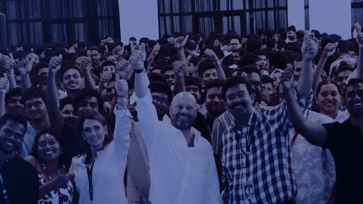
Photography · Midnight colour wash 
Blackout texture · dark surfaces 
Ink texture · light surfaces and print
04 · Co-branding
Partner lockups
Give both logos equal weight, separated by a 1 px rule in Midnight Ink at 25%, with x clear on each side.
- Match optical size, not exact height
- Both logos in one colour
- Never merge logos into a new mark
- Partner logo
Horizontal · default - Partner logo
Stacked · narrow and square spaces
04 · Downloads
Logo kit
Use SVG for print and anything that scales; WebP or PNG for slides, documents and web. All files are in the logo kit supplied with this guide.
Need something else? Contact your Choreo Labs partner or marketing contact for source files and campaign artwork.
Horizontal
Primary lockup, use by default
Stacked
Square and tall spaces
Centred
Large format and stage
C mark
App icons, avatars and favicons